Case study — Deconstructing the Dunkin’ app
redeem in one path. IA study
An information architecture study of a coffee run, one module at a time. I took the Dunkin’ app apart into modules and atoms, found where redeeming a reward breaks down, and redesigned it as a single path from Home to checkout.
 Play The Prototype
Role
Solo, UX & information architecture
Course
Information Architecture
Methods
Module map, atomic wireframes, gap analysis
Deliverables
Analysis deck, hi-fi Figma prototype
Tools used
What I used, start to finish.

Figma
Atomic wireframes & prototype

Claude
Analysis & writing support
01 — Core purpose
why the app exists
The Dunkin’ app exists to make your daily coffee
run faster and more rewarding.
Every part of the analysis was measured against those two words: faster and more rewarding.
Faster
Order ahead, skip the wait
Every user can order through the app and pick up without waiting in line. Speed is the promise.
More rewarding
Dunkin’ Rewards
Members earn points on every purchase toward free food and drinks, plus members-only offers.
02 — Module map
seven modules across three screens
I mapped the three screens every order passes through, then named the modules on each one.
Home
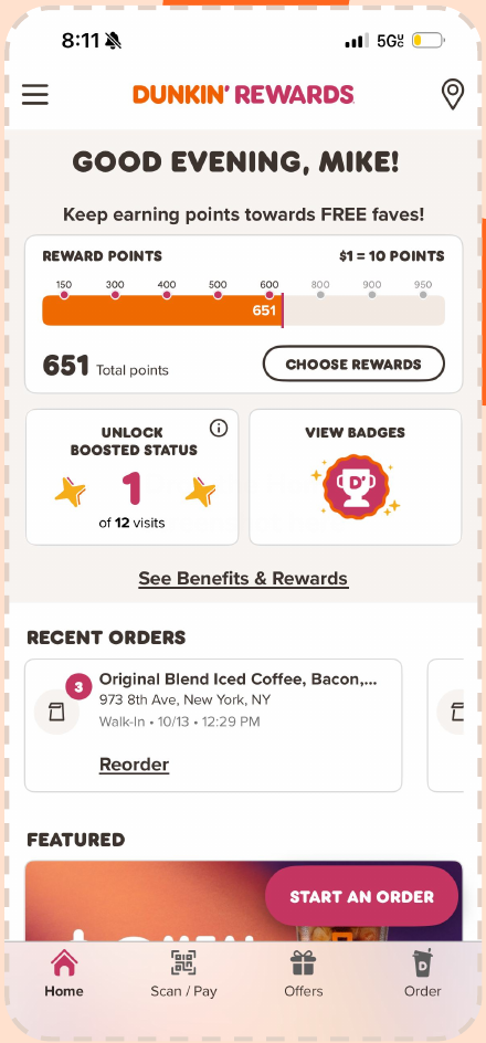
Module 01
Points progress tracker
Progress toward your next free reward
Module 02
Boosted Status card
Visits toward faster point earning
Module 03
Recent order card
Your last order, one tap to reorder
Store finder
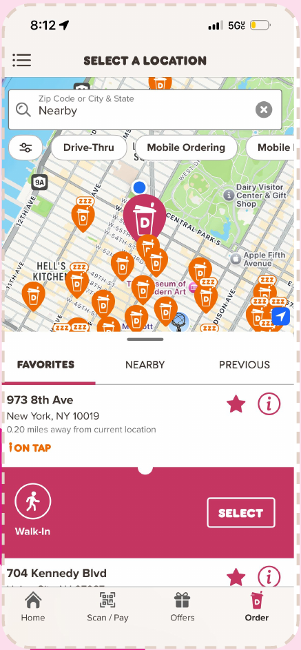
Module 04
Search & filters
Find a store and filter by service
Module 05
Store list
Tabs, store cards and pickup panel
Menu
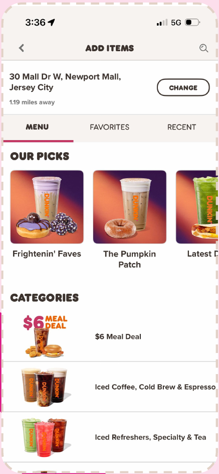
Module 06
Store info bar
Your store, with a Change button
Module 07
Our Picks carousel
Seasonal pick cards that scroll
03 — Atomic wireframes
seven modules, broken into atoms
Each module was rebuilt as a grayscale wireframe, with every atom labelled and the module outlined, side by side with the real screen.
Breaking the app down this far is what made the problems visible: the same idea showing up under different names, and pieces that didn’t lead anywhere.
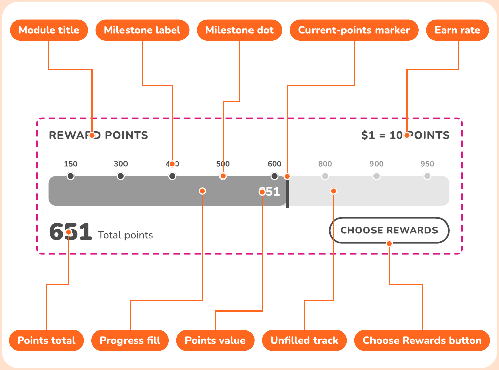
Atoms per module
01
Points progress tracker
10 atoms02
Boosted Status card
6 atoms03
Recent order card
7 atoms04
Search & filters
9 atoms05
Store list
15 atoms06
Store info bar
4 atoms07
Our Picks carousel
7 atoms04 — Gap analysis
redeeming a reward takes a detour
I screen-recorded myself using 300 points on a donut in today’s app.
Points are converted on one screen, the donut has to be found again in the menu, and the reward only shows up at checkout.
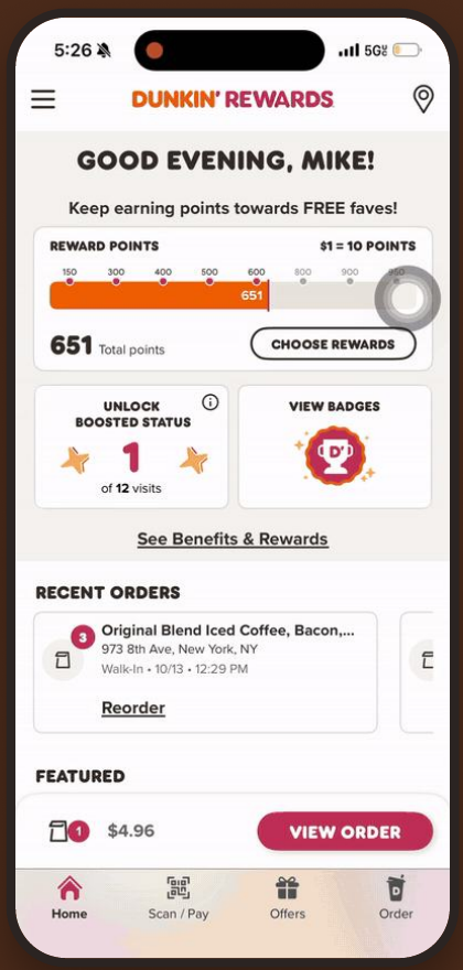
78 sec
start to receipt
9 screens
to redeem one donut
- 1
Choose Rewards
A list sorted by points. You tap Convert before choosing anything to eat.
- 2
Pop-up
The reward goes to “Offers… Rewards”, a label that’s cut off.
- 3
Home
“Redeem your rewards” is really your bag.
- 4
Menu
Nothing shows which items the reward covers.
- 5
Store map
You stop mid-order to hunt for a store.
- 6
Checkout
The reward sits below the upsells and a promo code.
- 7
Receipt
Points can’t be shown yet, and ads come first.
Points are spent at step 1, but you don’t see the
reward working until step 6.
Labeling
Seven names for one thing
Choose Rewards, Convert, Converting, Offers…Rewards, Redeem your rewards, Available offers & rewards, Free Donut Reward.
Organization
Rewards have no home
A converted reward lives under Offers. The Home section called “Redeem your rewards” opens your bag.
Navigation
Convert, then hunt
Converting doesn’t lead anywhere. You have to find an eligible item yourself, and the menu doesn’t help.
Feedback
No confirmation until the end
You only learn the reward worked at checkout, and the receipt can’t tell you what’s left.
05 — Proposal
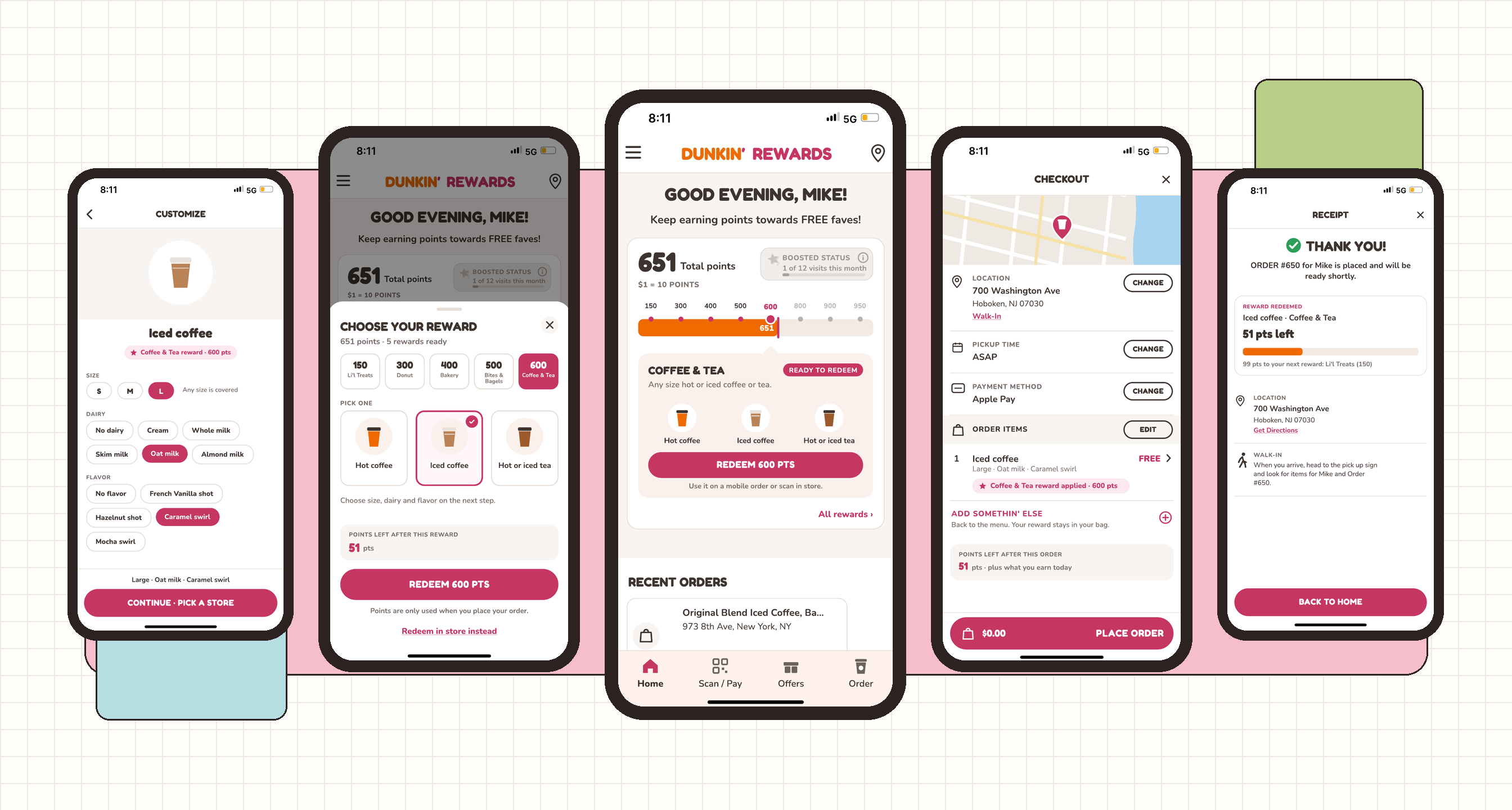
redeem in one path
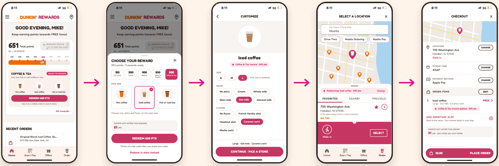
Pick the reward first. Every step after that is about getting it to you.
Instead of converting points into a voucher and hunting for an item, you choose the actual drink or food up front, and the reward follows you to checkout.
- 1
Home tracker
Tap a tier to see what it gets you, then Redeem.
- 2
Choose reward
Pick the item. No converting.
- 3
Customize*
Size, dairy and flavor in one place.
- 4
Pick store
Same store finder, plus what you’re redeeming.
- 5
Checkout
The reward shows on the item. Points come off here.
- 6
Done
Points used, points left, next reward.
*Skipped when there’s nothing to customize (hash browns, iced loaf slice, Stuffed Bagel Minis).
Points spent before you’ve chosen food.
Convert first, then find an eligible item yourself.
Points spent when you place the order.
Nothing is final until checkout, so changing your mind costs nothing.
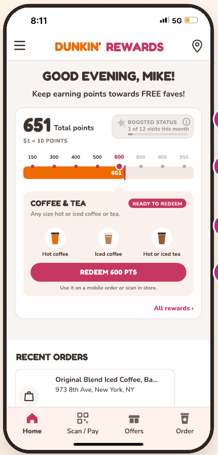
New Home tracker
Rewards you can see
- 1
Boosted folded in, Badges gone
Boosted Status becomes a chip in the tracker, with an info button for the rules. Badges didn’t help anyone redeem, so that card is gone.
- 2
Tap any tier to preview it
Inspired by the Starbucks app: the bar keeps Dunkin’s look, but every milestone opens a panel showing what that tier gets you.
- 3
Ready or locked, at a glance
Ready tiers say so. Locked tiers show how many points, and roughly how many dollars, you still need.
- 4
Redeem right from Home
One button starts the new flow. No trip to a separate rewards list.
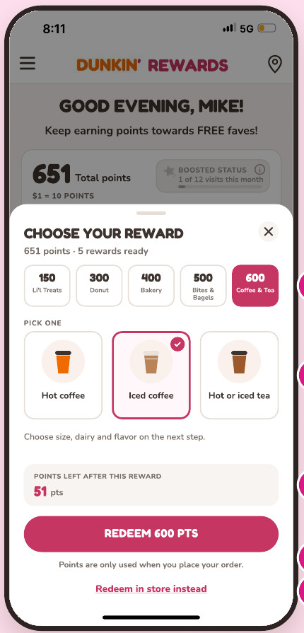
Choose your reward
Pick the reward, not a voucher
- 1
Only what you can get
The tabs list just the tiers your points cover, with the one you tapped already selected.
- 2
Choose the actual item
Pick the drink or food right here. There’s no separate convert step.
- 3
See what’s left
The sheet shows the points you’ll have after this reward.
- 4
Nothing is final yet
“Points are only used when you place your order.” Today, converting spends them right away.
- 5
Redeem in store instead
For people already at the counter: opens Scan / Pay with the reward attached.
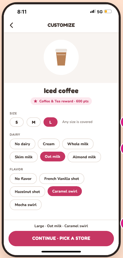
Customize
One screen for how you like it
- 1
One job per screen
The sheet picks the reward; this screen sets how you like it.
- 2
Choices you can see
Size, dairy and flavor are tappable chips with the current pick highlighted, not hidden dropdowns.
- 3
A running summary
The bar at the bottom spells out your drink before you move on.
- 4
Skip it when there’s nothing to choose
Rewards with no options go straight to picking a store.
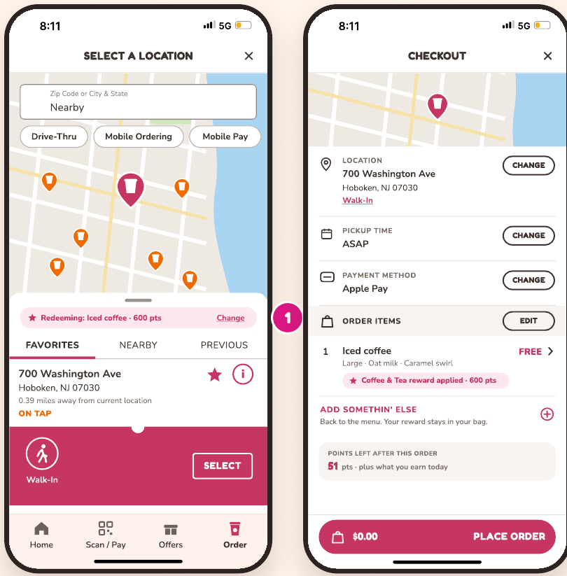
Store & checkout
The reward follows you
- 1
The store finder stays familiar
Same map, list and Walk-In panel as today, plus a “Redeeming” chip so you never lose track of the reward.
- 2
The reward sits on the item
Checkout shows the actual drink as FREE, tagged “Coffee & Tea reward applied · 600 pts”.
- 3
Adding more is optional
You can still add something else, but the reward isn’t buried in a cart you have to build first.
- 4
Points left, before you pay
The points box shows what you’ll have after this order, right above Place Order.
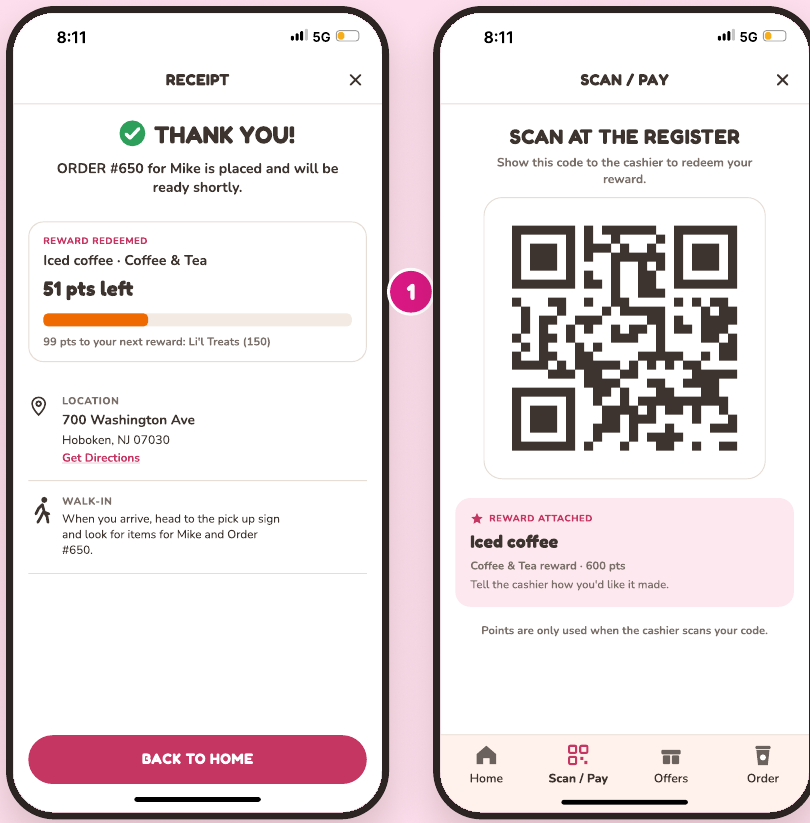
Done
Close the loop
- 1
The receipt confirms it
It shows the reward, the points left and names your next reward. Promos come after, not before.
- 2
In store, same reward
“Redeem in store instead” opens Scan / Pay with the reward already attached to your code.
- 3
Points come off at the counter
Nothing is spent until the cashier scans, so changing your mind costs nothing.
06 — New modules
five new modules, same method
The redesign was broken down the same way as the original, so every new piece is defined down to its atoms.
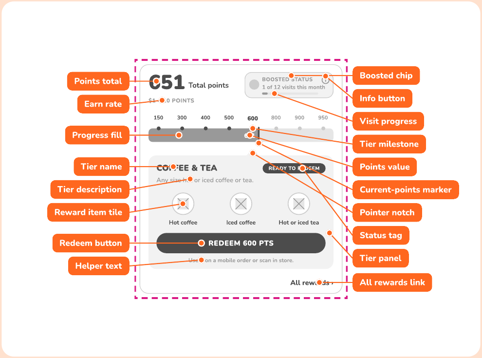
New module 1
Rewards tracker
Points, Boosted status and every tier in one card.
New module 2
Reward picker sheet
Pick the tier, pick the item, see what’s left.
New module 3
Customize panel
Size, dairy and flavor as visible chips, with a running summary.
New module 4
Reward line item
The reward rides to checkout as a free item.
New module 5
Points recap
What you redeemed, what’s left and what’s next.
07 — Why it works
back to the core purpose
Faster and more rewarding, the two promises from the start, now hold all the way through redeeming.
78 sec · 9 screens
Today: redeeming one donut, from my screen recording
6 screens
Redesign: Home to receipt
1 path
No convert step, no menu hunt
Faster
Redeeming starts on Home and ends at checkout. No convert step, no menu hunt, and items with nothing to customize skip a screen.
Clearer
One word, “reward”, everywhere. The tracker shows what each tier gets, and checkout shows the reward on the item it covers.
More rewarding
Points left and your next reward stay visible from the sheet to the receipt. Boosted progress lives right in the tracker.