Case study — X / Twitter redesign
less chatbot, more context. AI in search
A redesign of how AI shows up on X. Instead of sending people off to a separate Grok chat, we put it inside the two places they already go to make sense of things: their topic tabs and search.
 Play The Prototype
Team
Mike & Pooja
Type
Existing-product analysis + redesign
Focus
AI in topic tabs and search
Deliverables
Analysis, hi-fi prototype
Tools used
What I used, start to finish.

Figma
Wireframes & hi-fi prototype

Claude
Research & writing support
01 — The product
the internet’s
town square
X is the fastest place to find out what’s happening, and what people think about it.
Before designing anything, we mapped what X is for, who uses it and what the business needs from it.
Purpose 01
Know what’s happening
Breaking news, live events, sports and culture,
as they unfold.
Purpose 02
Hear every side
An open, public conversation where anyone can reply, quote or push back.
Purpose 03
Reach people directly
Creators, experts, brands and officials talk straight to their audience.
Who uses it
Readers want to stay informed. They mostly scroll and lurk: news, trends, sports, entertainment and the replies.
Creators and voices want to build an audience. They post takes, threads and video, and earn through revenue sharing and subscriptions.
What the business needs
Turn attention into revenue, while keeping X worth paying attention to.
Grow daily usage: more time on X means more ad inventory and data. Diversify revenue: grow Premium and data licensing so ads aren’t the only income.
02 — Where AI fits today
grading grok
Grok is capable, but it’s bolted on. X pushes it as a destination instead of using it to improve what people already do.
Pain point
What AI does today
Verdict
Information overload
Grok summarizes trending stories in Explore and explains any post from the Grok button.
The most useful part of Grok today.
Hard to know what’s true
People tag @grok to fact-check. Community Notes uses an algorithm to surface notes people agree on.
Grok can be confidently wrong.
A noisy feed
The For You feed ranks posts by predicted engagement.
Optimizes for engagement, not relevance.
Search takes work
The Grok tab answers questions in a separate chat.
Lives outside search, so it’s a detour.
Usefulness
Summaries of trending topics and posts genuinely save time.
Placement
A whole nav tab plus a logo on every post feels pushy.
Fit with why people use X
People come for news, people and conversation, not a separate LLM.
Trust
Answers can be confidently wrong, and sources aren’t always easy to check.
03 — The takeaway
AI on X works best when it helps people make sense of what’s already in front of them, and least when it sends them somewhere else.
Summaries in context are useful. Grok as a separate destination doesn’t fix the core pain points: overload, trust and noise.
04 — The pivot
we changed the brief
A better chatbot wouldn’t fix the real issue: people don’t come to X for a chatbot.
So instead of redesigning Grok, we designed a new AI experience that lives where the need already is.
Make the Grok chatbot better
Better answers, but still a separate place people have to go. It doesn’t match why they open X.
Introduce a new AI experience
AI shows up inside topic tabs and search, right where people are already trying to make sense of something.
Why 01
Highest intent
People search when they want to make sense of a topic, not just pass time.
Why 02
Biggest pain
Search results are a wall of posts with many viewpoints and no overview.
Why 03
Proven elsewhere
Threads and Bluesky show that subtle, in-context AI lands better than a chat tab.
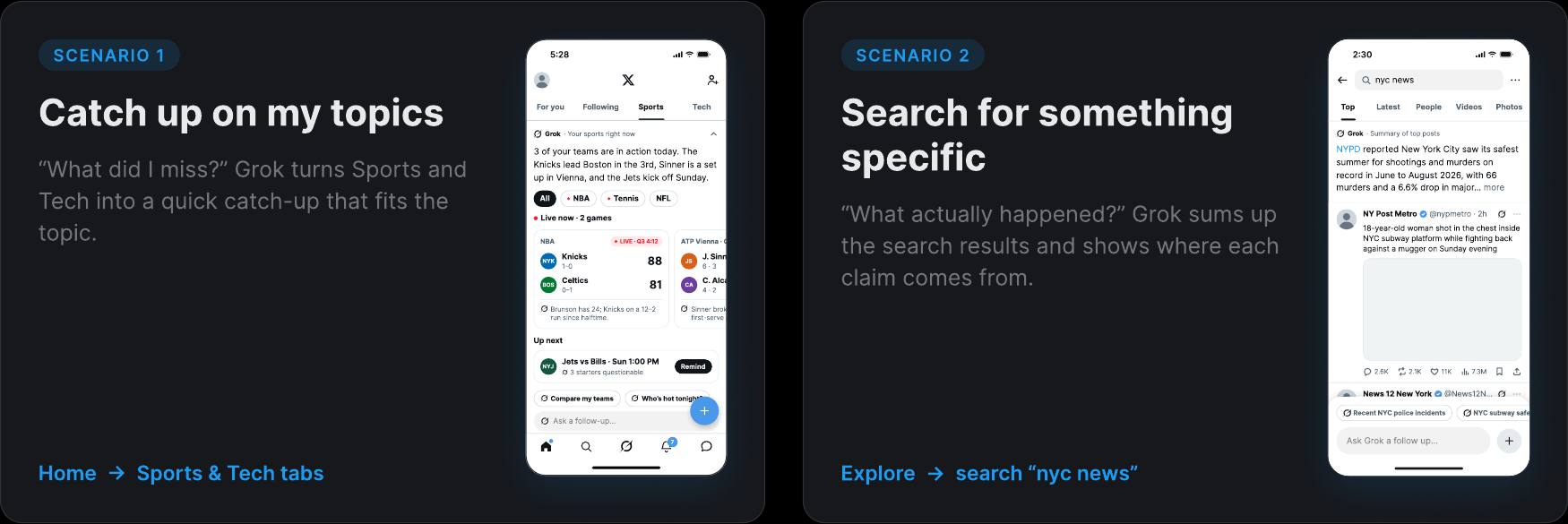
05 — Scenario 1
catch up on my topics
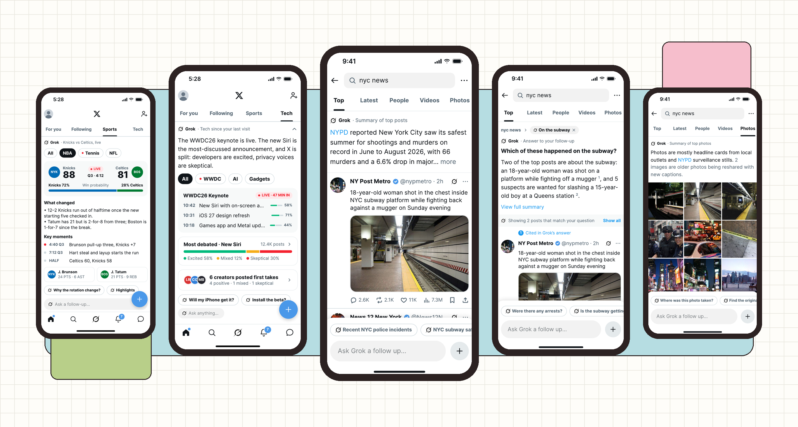
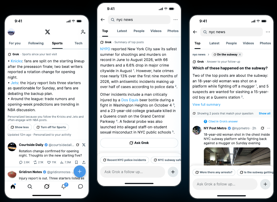
“What did I miss?” Grok turns the Sports and Tech tabs on Home into a quick catch-up that fits the topic.
We followed one person through two everyday moments. This is the first: opening X to catch up on the things they follow. Path: Home → Sports or Tech tab.
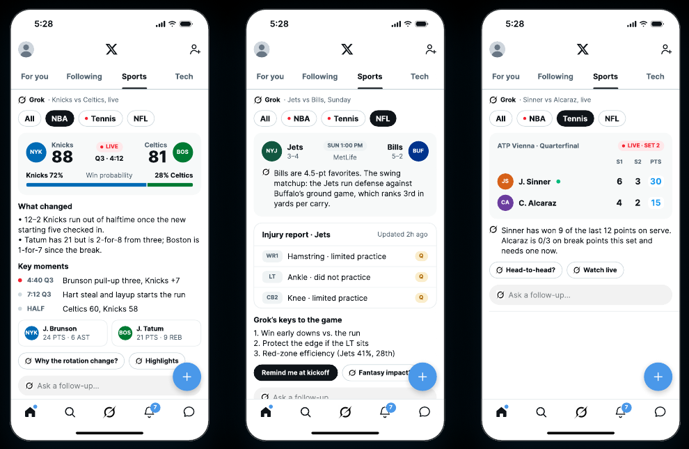
Generative UI
One summary format can’t fit every topic, so Grok picks the layout that fits the content.
- 1
The content decides the layout
A live NBA game gets a scoreboard and win probability, an NFL game gets an injury report, tennis gets a set-by-set score.
- 2
Visual first, text second
Numbers, status and trends come before sentences, so the story reads at a glance.
- 3
Personalized, with controls
Based on accounts you follow and posts you engage with, and it says so. Show less or turn it off per topic.
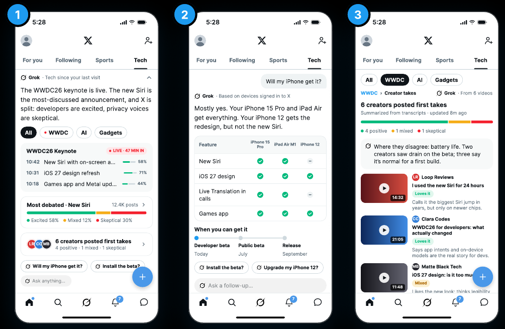
Further interactions
Follow-ups turn the catch-up into answers about you, and you can always shrink it back to posts.
- 1
Summarizes the viewpoints
A sentiment bar shows the split: excited, mixed, skeptical, and where people disagree.
- 2
Answers follow-up questions
“Will my iPhone get it?” becomes a checklist for the devices you own.
- 3
Leads back into content
Suggests creators’ videos and posts to keep exploring, rather than ending the conversation in a chat.
06 — Scenario 2
search for something specific
“What actually happened?” Grok sums up the search results and shows where each claim comes from.
Path: Explore → search “nyc news”. The summary sits above the results, with numbered citations linking to the posts it used. And it changes with each results tab.
Top
What’s the story?
An overview of the top posts, with sources.
Latest
What’s new?
A live timeline that updates as posts come in.
People
Who’s worth following?
Says why each account is relevant.
Videos
What’s in these clips?
Describes the footage and flags re-uploads.
Photos
Are these real?
Describes the images and flags old photos.
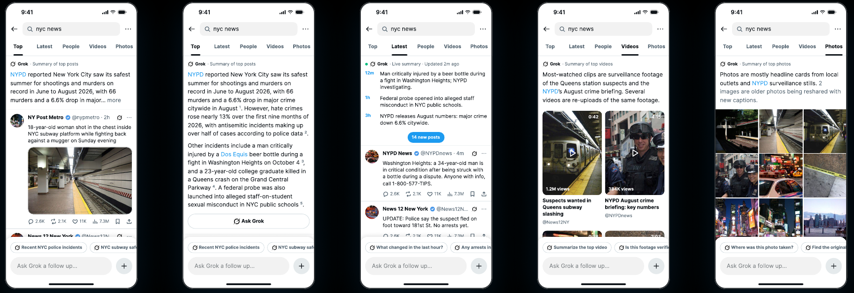
Designing for trust
Our own analysis said Grok can be confidently wrong, so every claim in a search summary carries a numbered citation, and the Photos and Videos tabs actively flag recycled media.
07 — Prototype
A clickable hi-fi prototype of both entry points.
- 1
Home → tap Sports or Tech
Open the catch-up, expand it, hide it or turn it off.
- 2
Explore → search “nyc news”
See the summary change across Top, Latest, People, Videos and Photos.
- 3
Ask Grok a follow-up
“Which ones were on the subway?” narrows the results to the posts that match.
08 — Process
sketches, flows and ideas we set aside
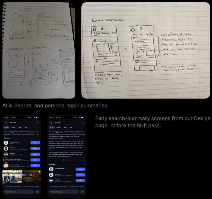
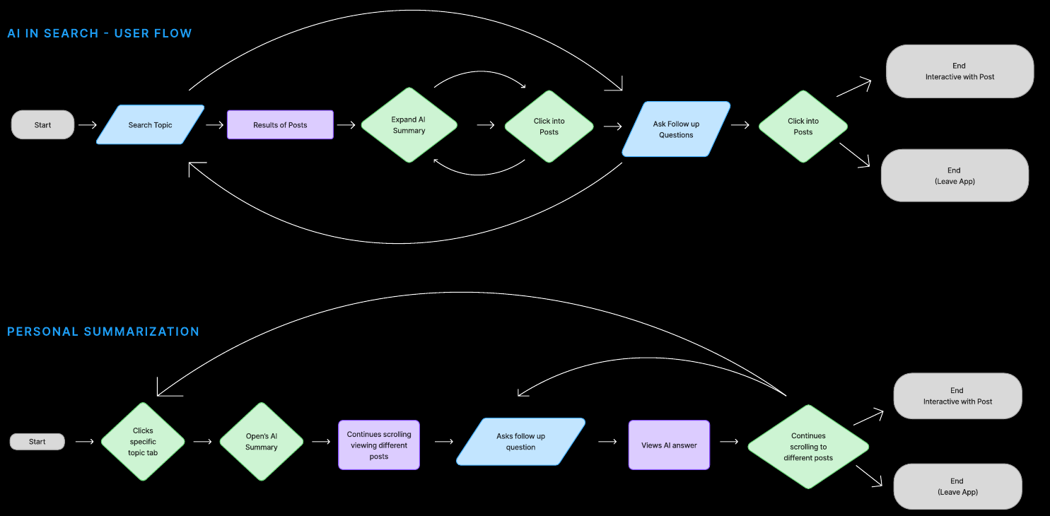
We sketched both directions on paper, mapped the user flows,
then pushed early dark-mode search screens before the hi-fi pass.
Ideas we explored
Summaries on high-traction posts
Open a popular post and Grok summarizes it and the replies.
A “More like this” button
From a post, Grok finds similar posts, or you tell it which topics you want more of.
Redesign the existing Grok chatbot
A better chatbot doesn’t change why people open X, and Grok already has its own app.
09 — What’s next
taking it to the final
This was our midterm. These are the questions we want the final version to answer.
Tie it to the business
A good summary could mean people leave sooner. We want to show how follow-ups and “shrink back to posts” lead people deeper into X, and whether this belongs in Premium.
Design for uncertainty
What happens when sources disagree, Grok isn’t sure, or a Community Note contradicts the summary? The Tech tab’s viewpoint bar is a start.
Bring creators in
If Grok summarizes six creators’ videos, those creators should still get the credit and the views.
Test with real people
Short interviews to confirm the pain points, then usability tests of both flows in the prototype.