Case study — Juli Henderson, In Our Arms
turning pain into purpose. Brand + website
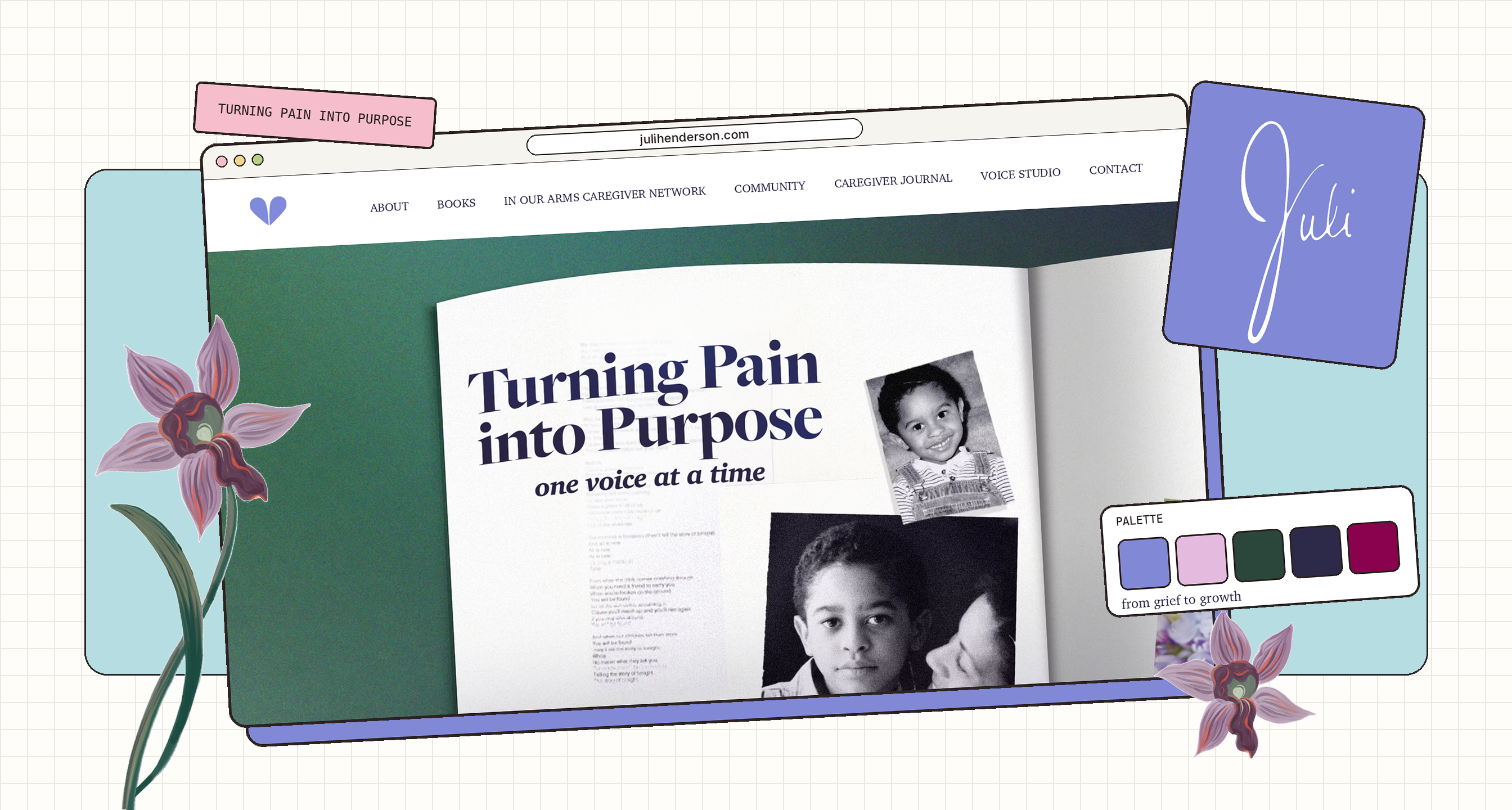
A new brand and website for Juli Henderson: author, voice teacher, caregiver advocate and the voice behind the In Our Arms blog. The work had to hold her grief and her growth in the same place.
 Visit Live Site
Client
Juli Henderson, In Our Arms
Studio
Colorbrand NYC
Role
Strategic Designer
Deliverables
Brand guidelines, website
Tools used
What I used, start to finish.

Figma
Website screens & layouts

Adobe Illustrator
Logo & brand graphics

Adobe Photoshop
Photo editing & textures

Miro
Brainstorms & research

Squarespace
Building the live site
01 — The problem
a story bigger than its website
Juli’s writing was powerful. Her old website didn’t look like it.
Juli writes In Our Arms for people caring for loved ones who are elderly or living with disabilities. Most of it comes from her own life: caring for her son Robert, who lived with a rare mitochondrial disease, and learning to live with grief after he passed at 18.
Her old site wasn’t appealing and didn’t feel like her. With plans to become a published author, she needed a brand and a website that could carry a book, a community and a voice studio, not just a blog.
02 — The challenge
grief and growth, in one brand
How do you design around loss without making the brand feel heavy?
Lean too hard on sadness and the brand pushes away the caregivers it’s meant to comfort. Lean too hard on hope and it erases what Juli went through. Every choice had to say both things at once: this is hard, and there is a way through.
“Because I experienced caregiving and traumatic loss with few resources, I want to change the experience of the often lonely caregiving journey…”
— Juli Henderson, mission statement
03 — Process
listening first
We started with Juli, not with visuals. Over several meetings and brainstorming sessions we went back and forth on her story, who she writes for and how she wants people to feel when they find her.
That work became her mission and her tone of voice. Every design decision after that was checked against them.
What
Understanding, resources for hope and the courage to face the realities of caregiving, while helping the community advocate for loved ones who may not have a voice.
How
Sharing hard, raw truths with candor and vulnerability in faith-based conversations: as a writer, an author and a public speaker.
Why
Juli went through caregiving and traumatic loss with few resources. She wants the next caregiver to feel less alone.
Tone of voice
04 — Brand identity
every choice carries both
Each piece of the identity pairs the grief with the growth.
Here’s what we chose, and why.
Decision 01
Her own signature
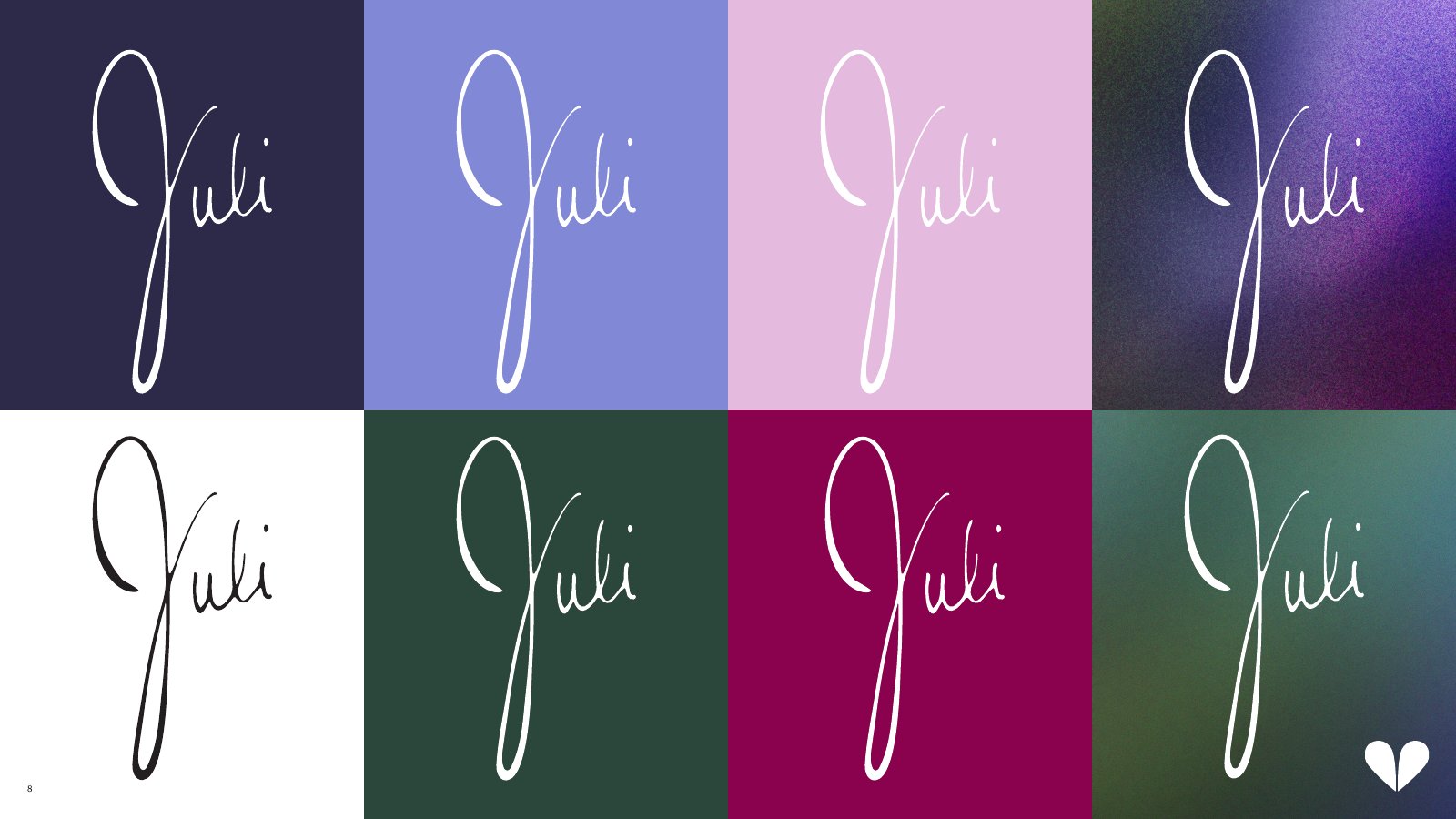
The logo is Juli’s handwritten signature. It’s how an author signs a book, and it puts her name and voice first. It works in white or ink on every brand colour.
Why it works
Readers come for Juli, not an organisation. A signature feels like a note from her.
Decision 02
A broken heart that still holds
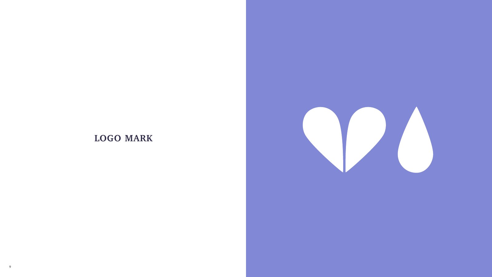
The mark is a heart split down the middle, paired with a single teardrop. The two halves never touch, but together they still read as a heart.
Why it works
It names the loss honestly without letting it be the end of the story.
Vibrant Periwinkle
#8189D6 · 50%
White
#FFFFFF · 0–50%
Joyful Lilac
#E4BADE · 0–25%
Growth Green
#2B463B · 0–25%
Deep Grief Purple
#2C2949 · 0–25%
Nurturing Magenta
#8A024D · 0–25%
Decision 03
Colours named for the journey
The palette is named for what it carries. Deep Grief Purple and Growth Green anchor it, Joyful Lilac and Nurturing Magenta add warmth, and Vibrant Periwinkle leads at about half of any layout.
Why it works
Leading with periwinkle keeps the brand hopeful; the darker grief and growth colours give it weight without taking over.
Decision 04
Set like a book
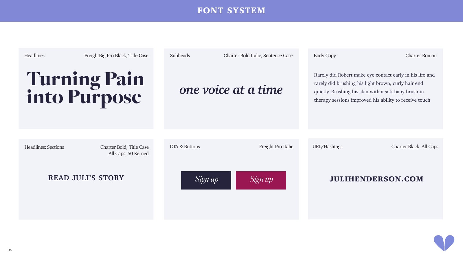
FreightBig Pro Black for headlines, Charter for body copy and Charter Bold Italic for soft, sentence-case subheads. Buttons use Freight Pro Italic.
Why it works
An editorial pairing makes every page feel like part of a book, which sets Juli up as the author she wants to be.
Decision 05
Grain, flowers and family
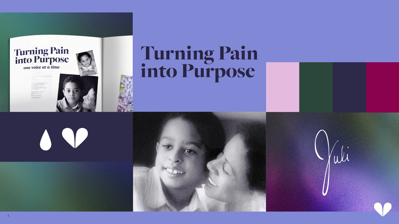
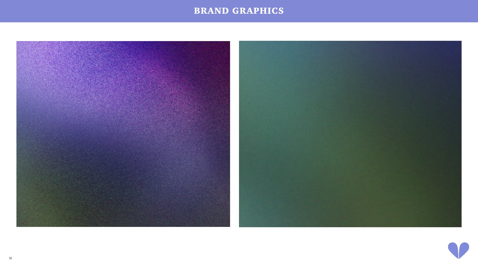
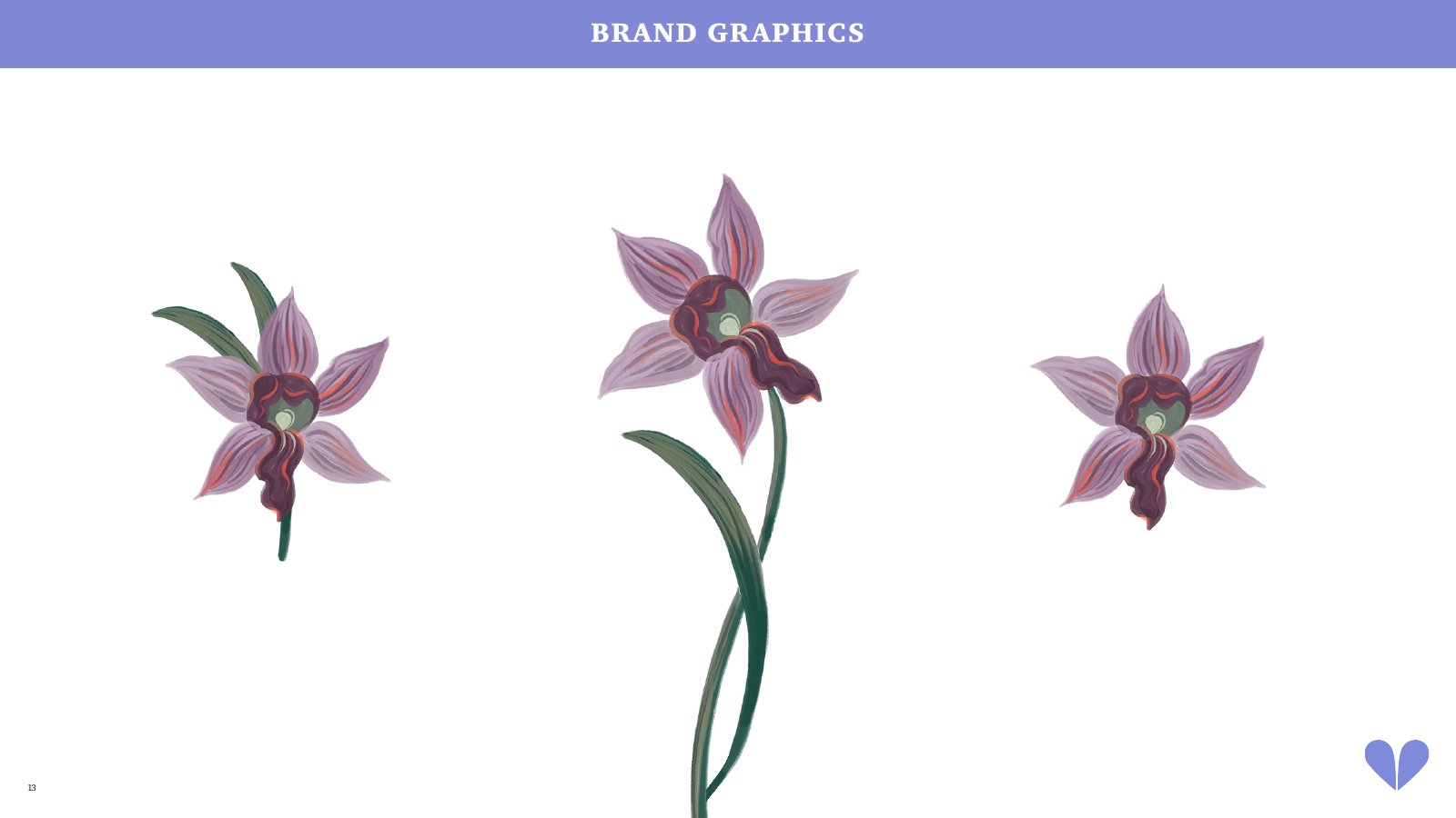
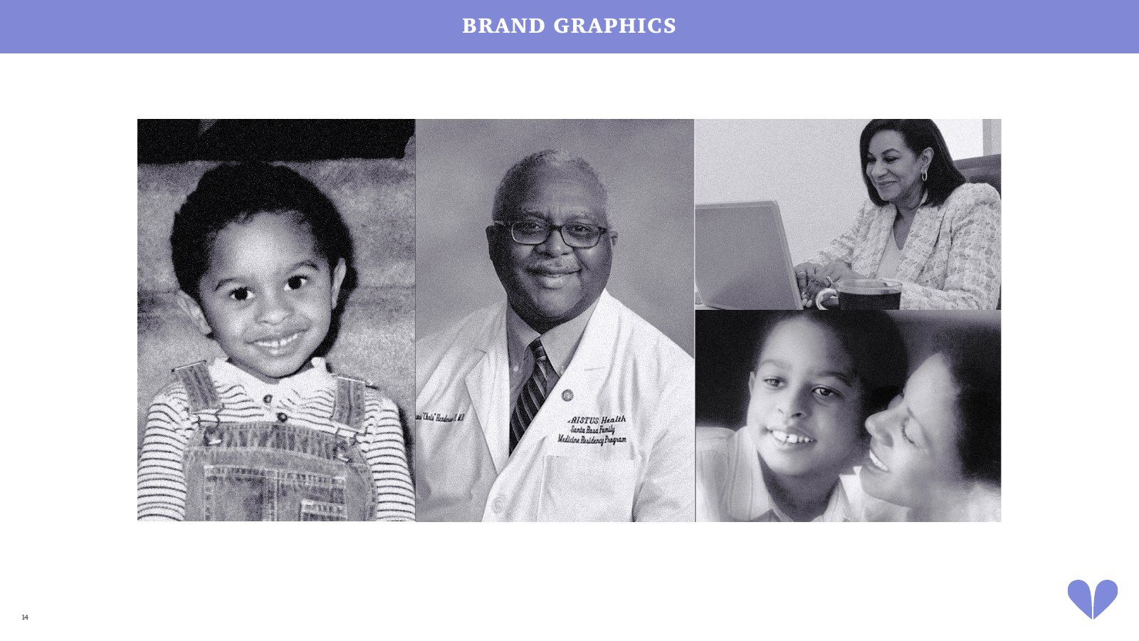
Grainy gradients drift from purple into green, hand-painted orchids add softness, and family photos get a cool duotone so they sit calmly beside everything else.
Why it works
The gradients literally move from grief to growth, so even the backgrounds tell the story.
05 — Website
from brand to screens
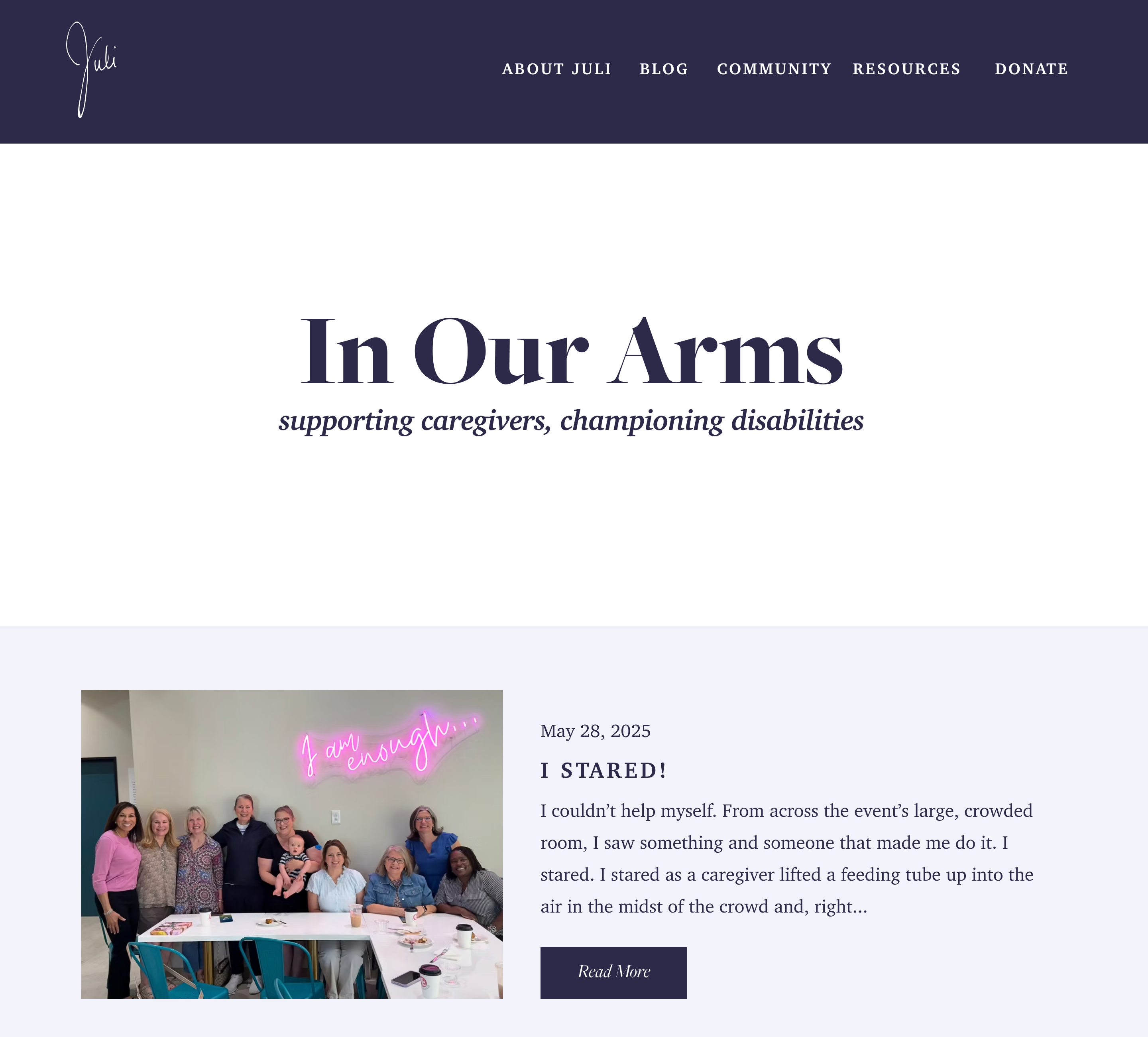
I designed the core pages in Figma as the basis for the redesign. Each one applies the guidelines to a different part of Juli’s world.
On every page
Every page closes the same way: a “Let’s be friends” mailing-list signup and “Voice of Healing”, a link to Juli’s Spotify playlist, because for Juli, music is medicine.
The blog home
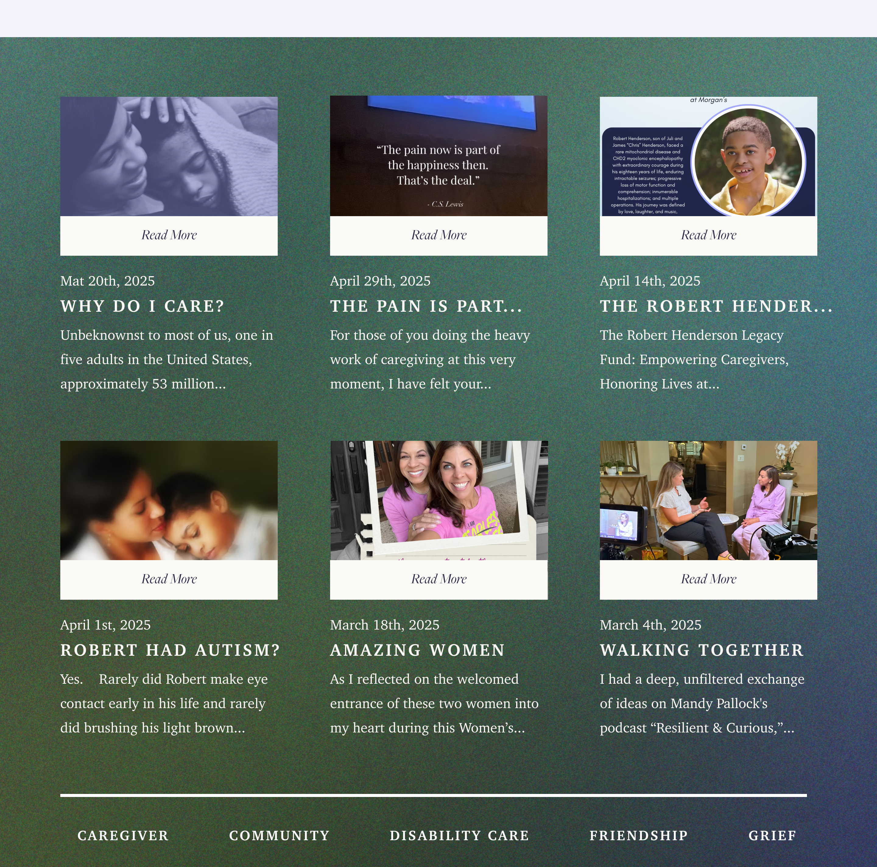
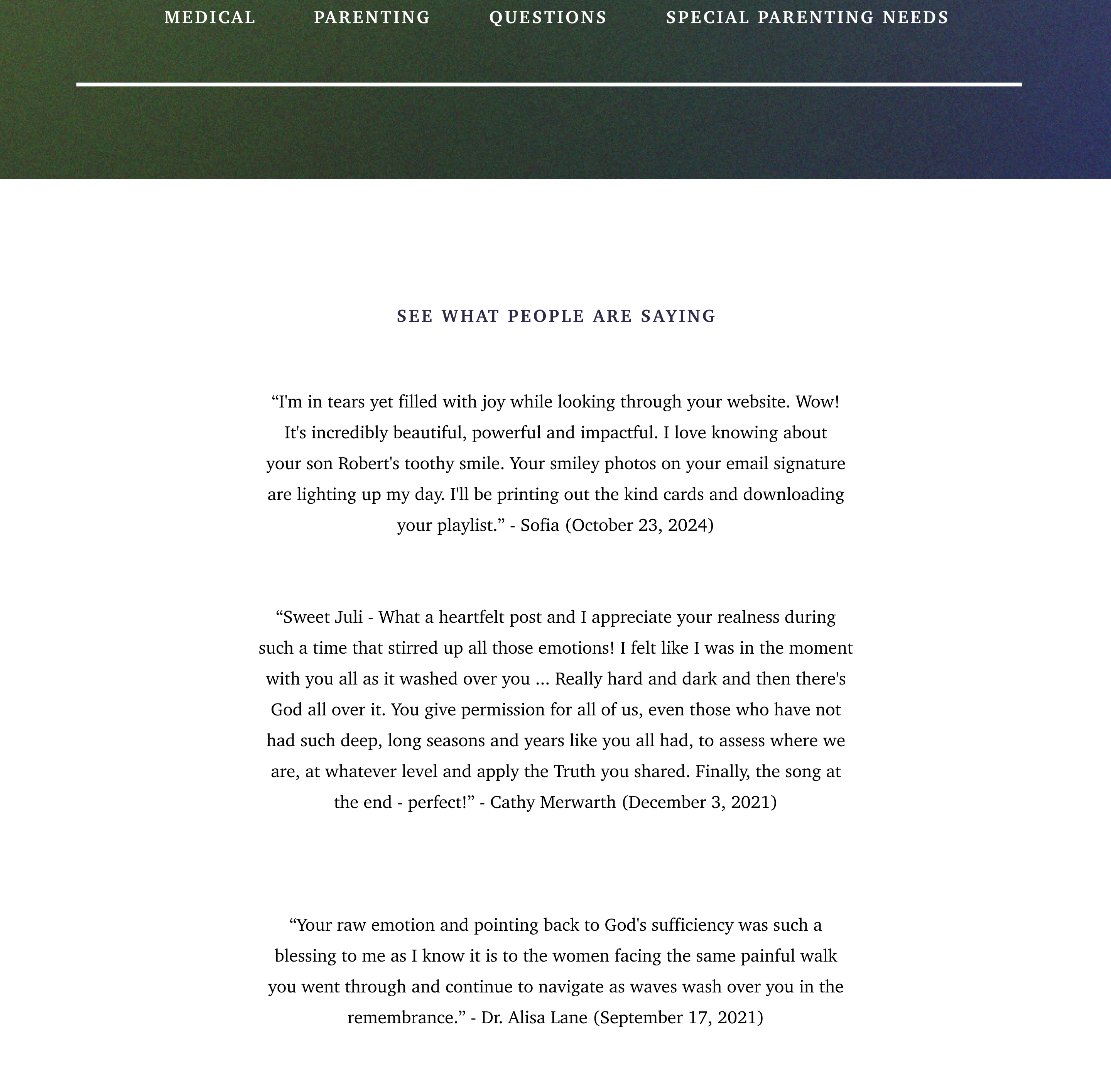
Posts sit on a purple-to-green gradient band, with topic tags like Grief, Parenting and Special Parenting Needs so caregivers can find stories like theirs. Reader comments follow to build trust.
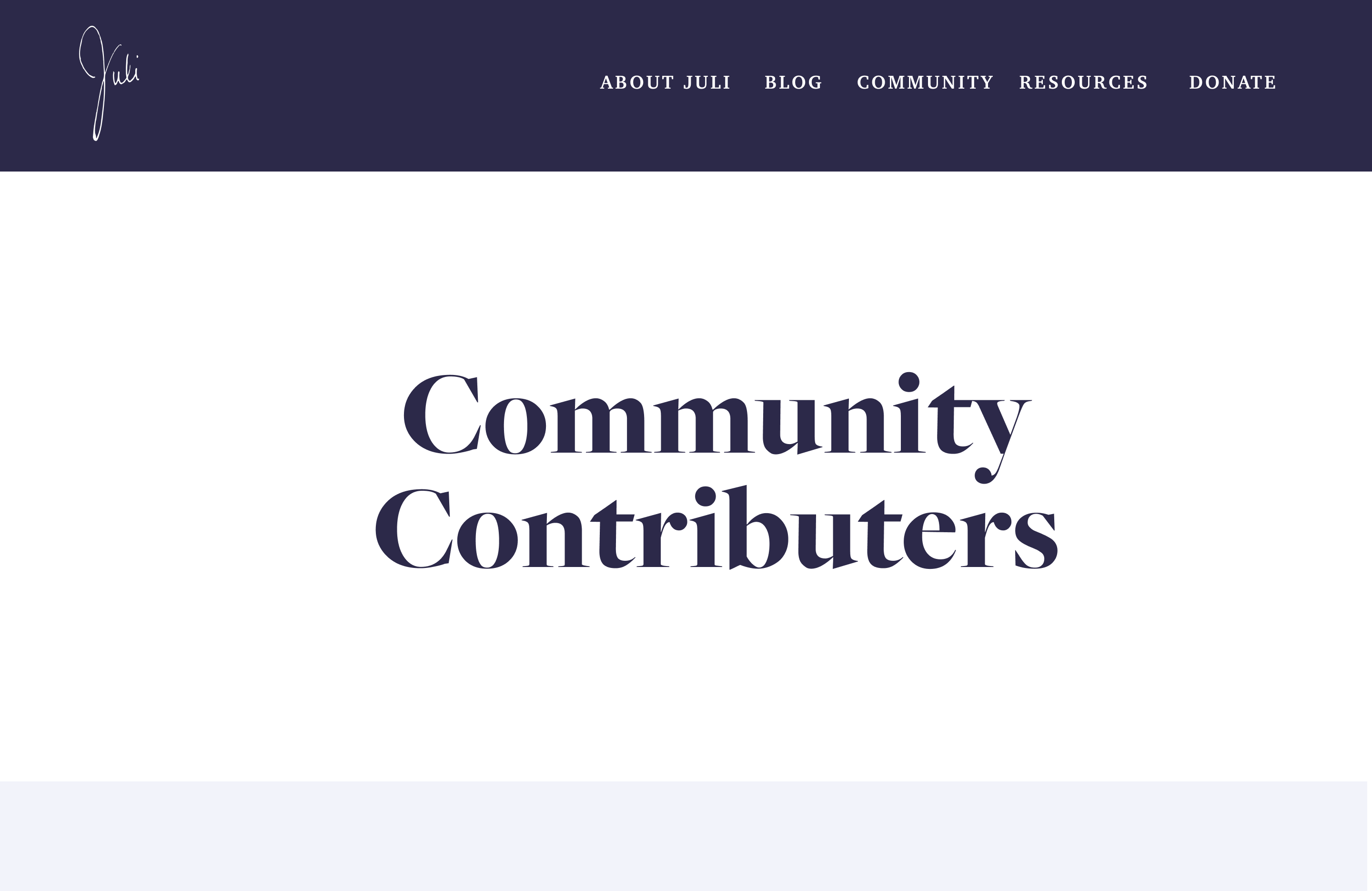
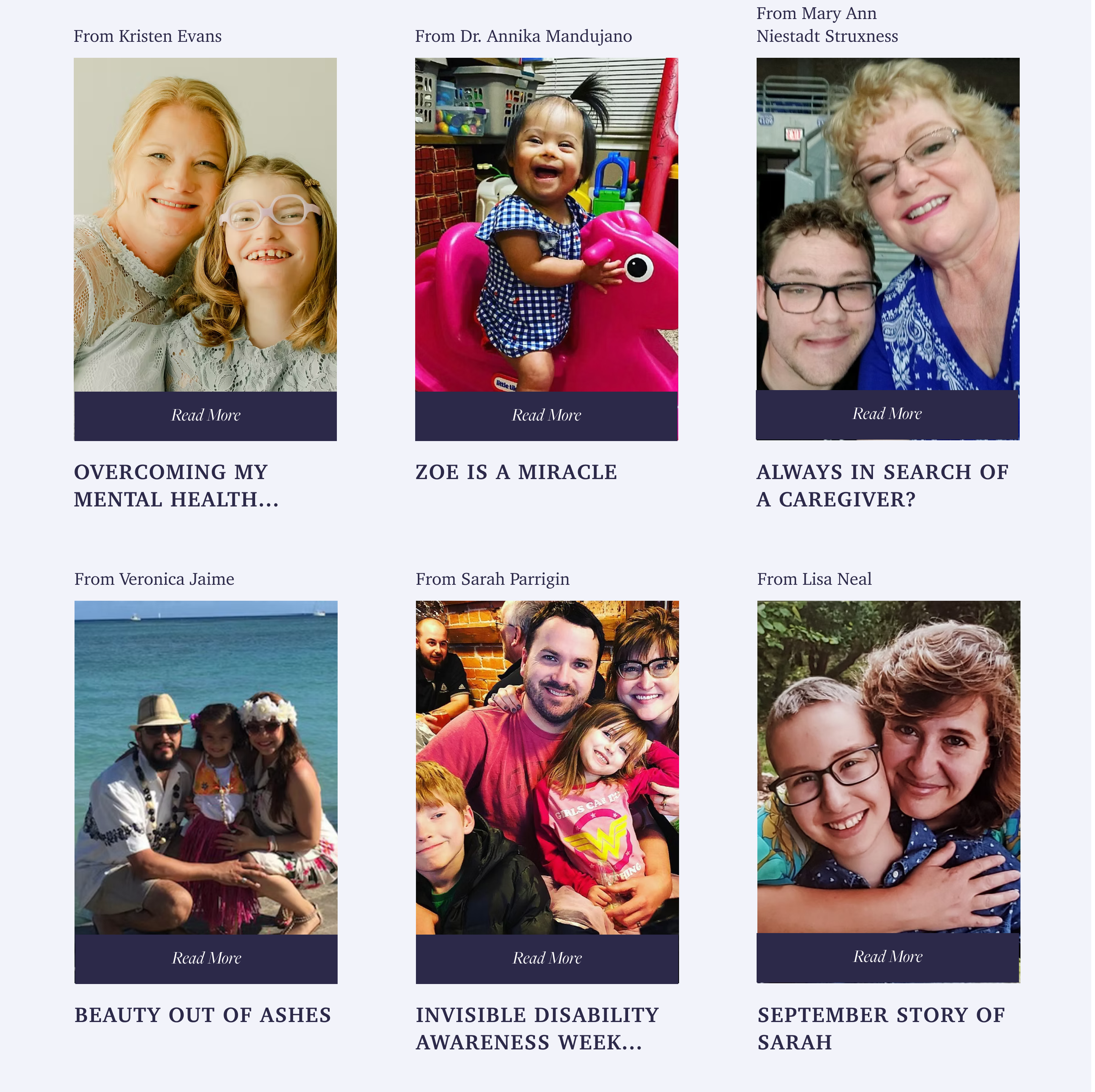
Community Contributors
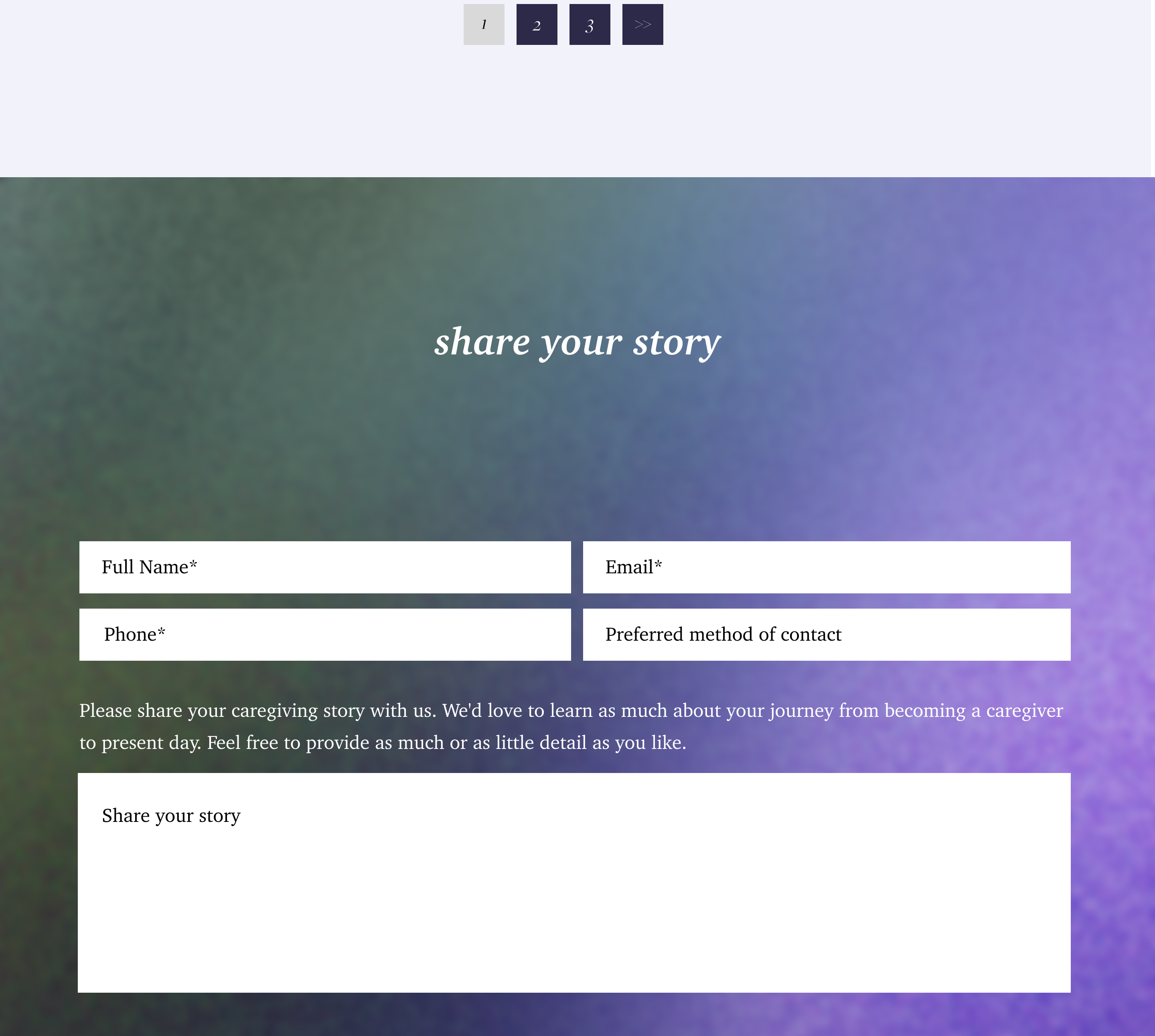
Other caregivers’ stories get the same weight as Juli’s. The “share your story” form asks about both the most joyous and the hardest parts of caregiving, mirroring the brand’s two sides.
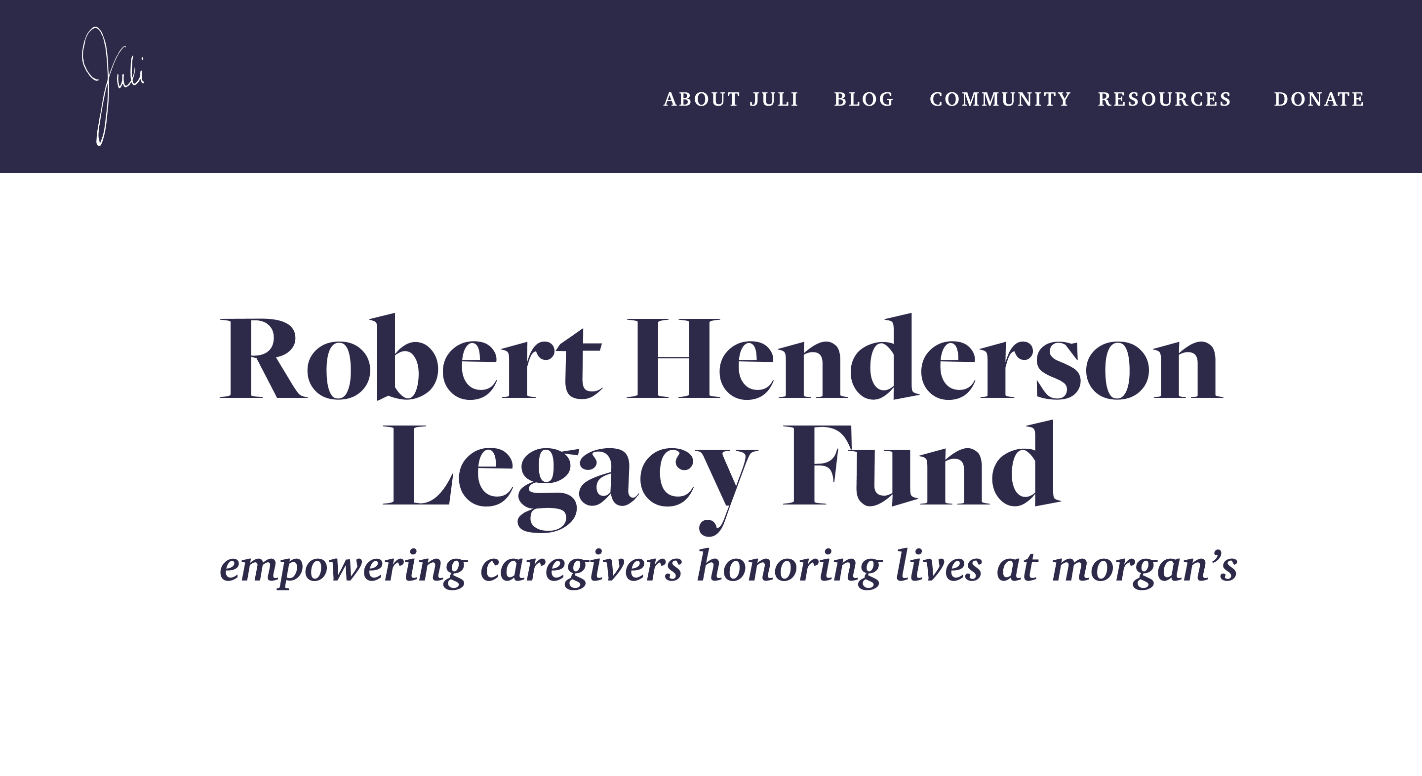
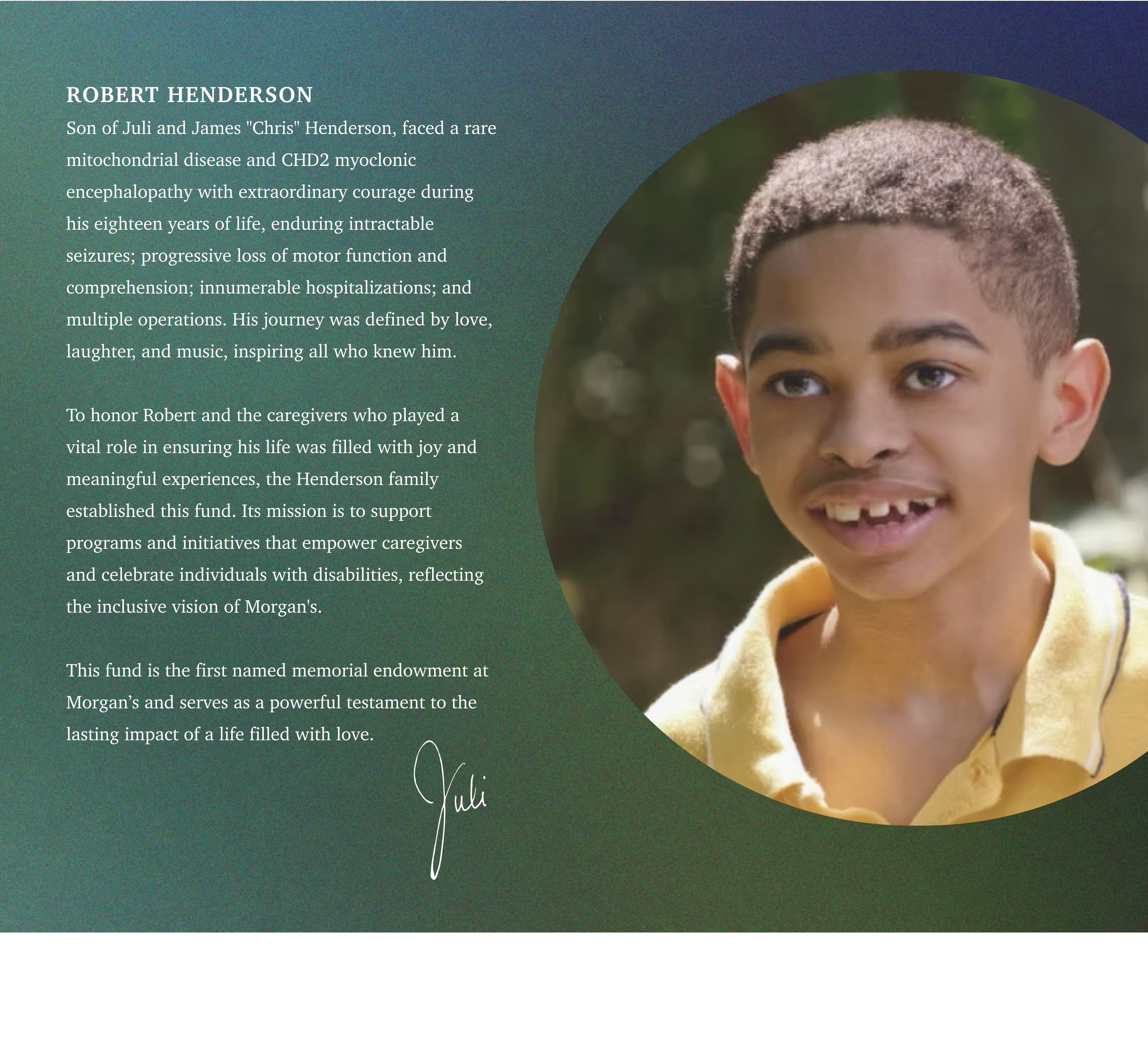
Robert Henderson Legacy Fund
Growth Green carries the page that honours Robert, closing with a simple donation QR code for Morgan’s.
Contact
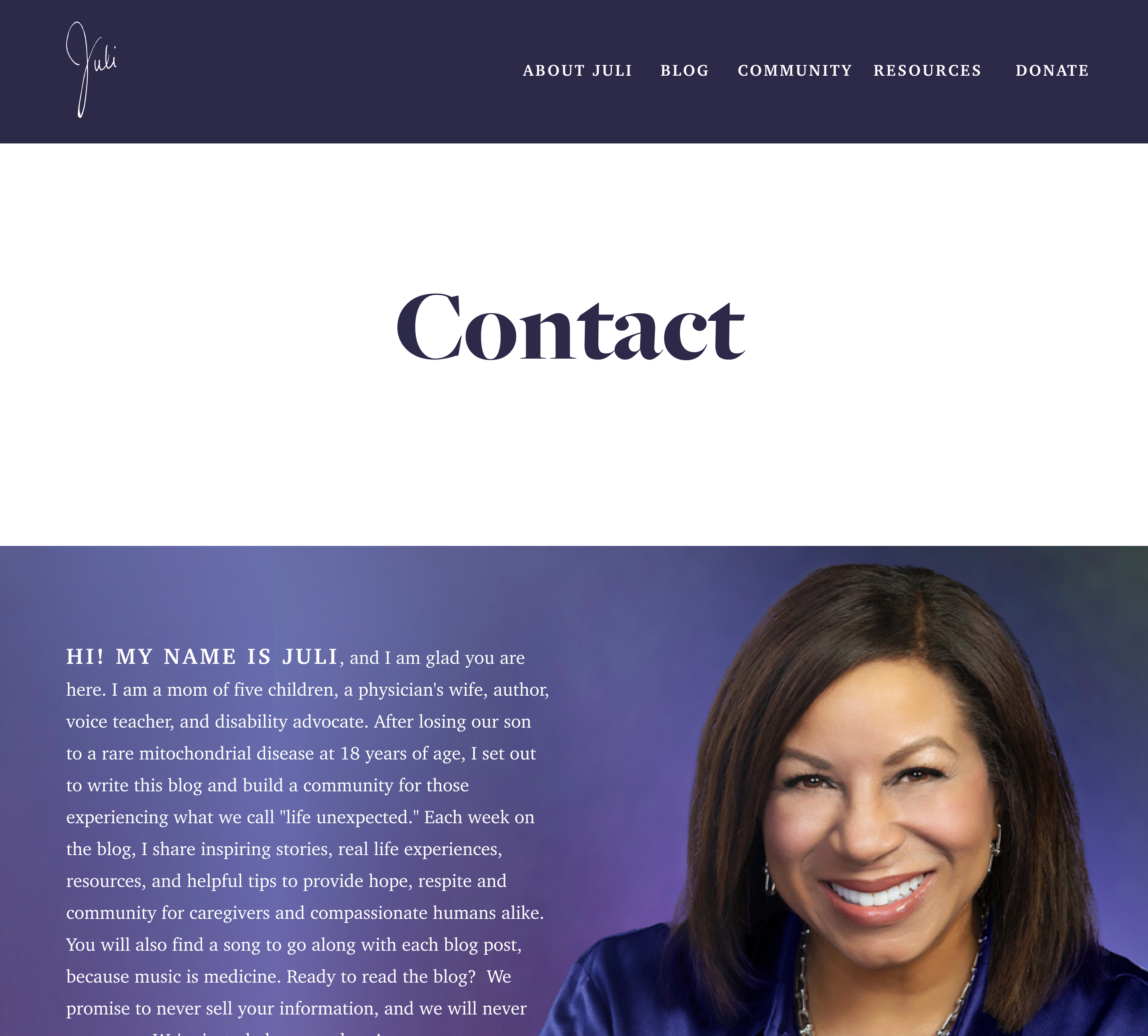
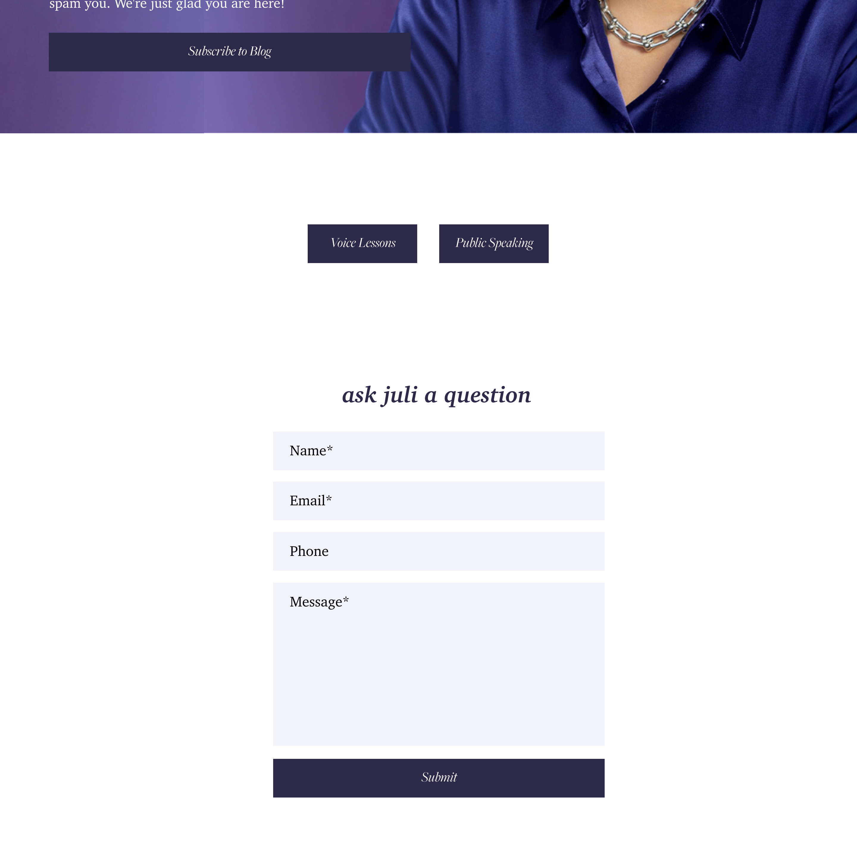
Juli introduces herself in her own words over her portrait, keeping the tone personal to the last page.
06 — Final product
a platform that kept growing
The live site builds on this foundation, and it has grown with her.
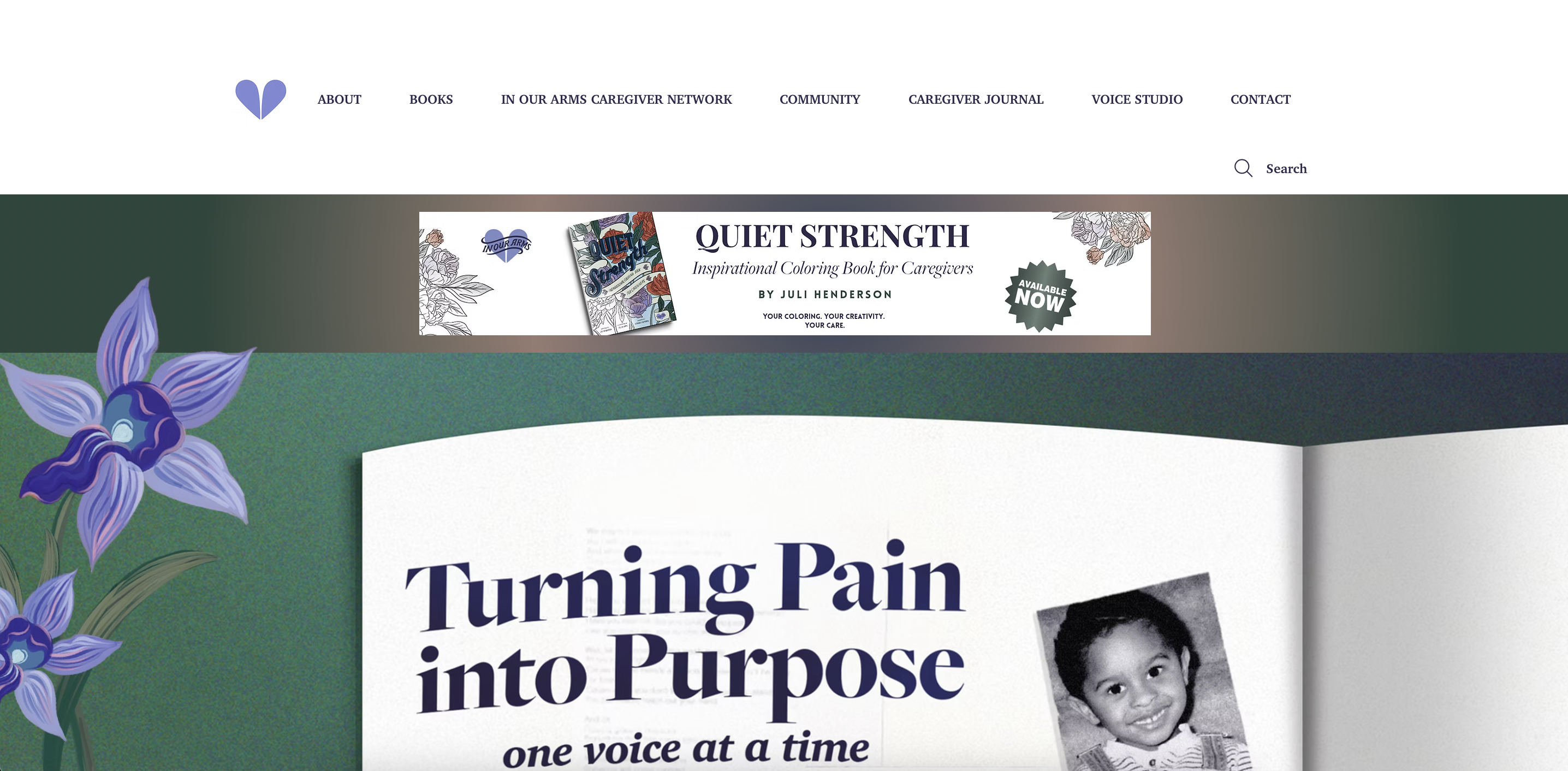
julihenderson.com now holds the In Our Arms Caregiver Network, a caregiver conference, her books (including the Quiet Strength coloring book), the Caregiver Journal and the voice studio, all under the same signature, palette and type. The system was built to stretch, and it did.
07 — Outcome
a brand that holds both.
Juli got a brand that feels like her and a site that’s ready for an author, not just a blogger. Her readers noticed.
“I’m in tears yet filled with joy while looking through your website. Wow! It’s incredibly beautiful, powerful and impactful.”
— Sofia, reader comment on In Our Arms
08 — Final thoughts
what i’m taking with me
Branding something this personal starts with listening, not designing.
Research comes first
The mission and tone-of-voice work made every visual decision easier to make and easier to defend. Research is what turned a feeling into a brand.
Users and the client
Juli’s story had to stay hers, but the site also had to work for caregivers looking for help. I learned to design for both without losing either.
My first digital product
This was my first step from brand design into designing for screens, and where I started thinking about how people move through a site, not just how it looks.